


ART DIRECTION | IDENTITY DESIGN
Working with PLINTH AGENCY, I art directed the rebrand for HIFI Kitchen. a modern Filipino-American QSR concept in the heart of The Historic Filipinotown district in Los Angeles. The owner wanted to update the brand pattern and logo to not feel so “clip art-ish.” The current visuals had run their course and he felt a rebrand could breathe new energy and life into his restaurant, especially amidst a global pandemic.

HIFI’s former brand pattern used primary colors and every even spacing.

While the Filipino cuisine that HIFI Kitchen was known for being modern, their brand pattern felt dated.


The owner of HIFI grew up in the golden era of hip-hop and was a b-boy himself. He wanted the new brand to have the spirit of hip-hop culture, the scrawled quality of modern street art, and incorporate the iconic RHOMBUS shape of the physical outline of the HIFI district in LA. It was important to capture the spirit of the neighborhood pride of HIFI and merge it with the music culture that the owner, Justin loved.
To accomplish this I was able to hide the rhombus shape with the “I” of the “HIFI” word mark. Taking their primary color palette and making it more saturated and deep, I gave a nod to the colors of the Philippine flag, without using the cliche’ SUN + STARS motif.


Brand pattern illustrated by Erwin Jastilanna at PLINTH AGENCY.

Website design by PLINTH AGENCY.
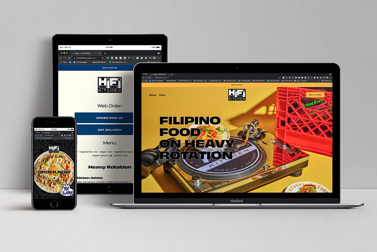
Website design by PLINTH AGENCY.


The brand pattern became the signature for the environmental graphics.
