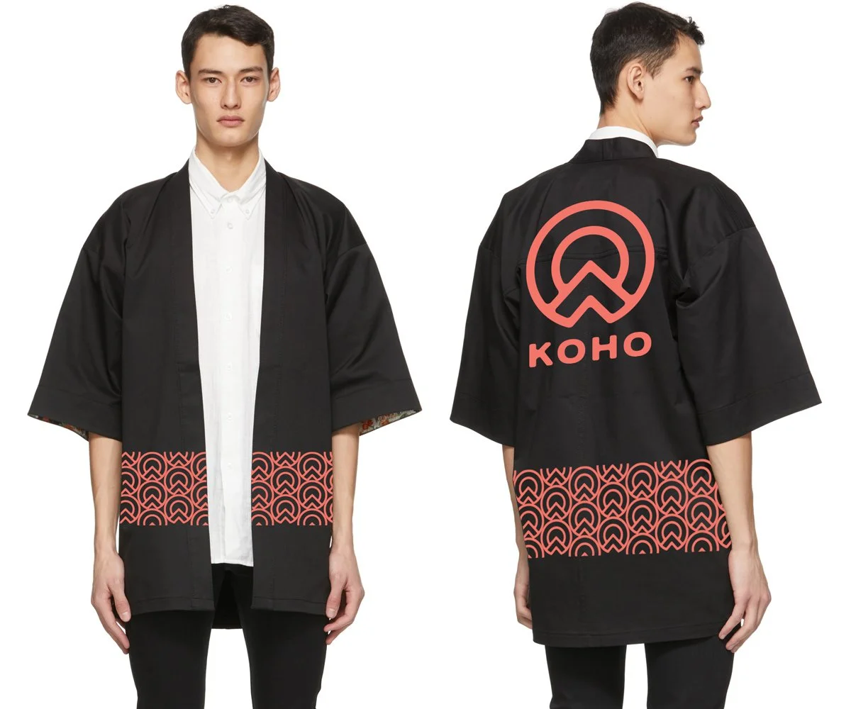

ART DIRECTION | IDENTITY DESIGN | EVENT CAMPAIGN
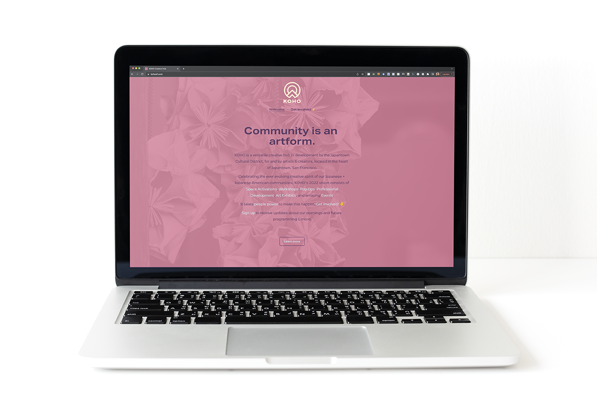
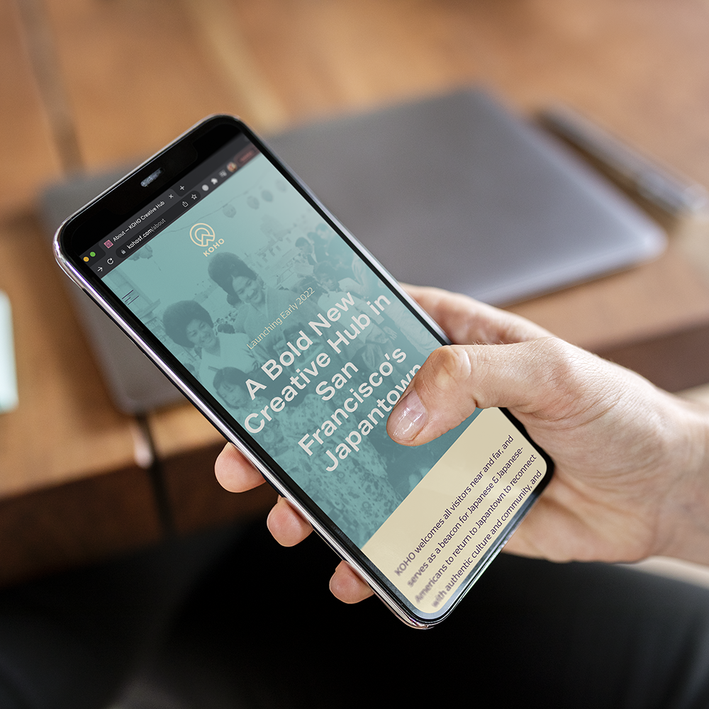
Working with PLINTH AGENCY, I provided art direction for the KOHO Creative Hub brand. KOHO is a versatile creative hub in development by the Japantown Cultural District, for and by artists & creators, located in the heart of Japantown, San Francisco.
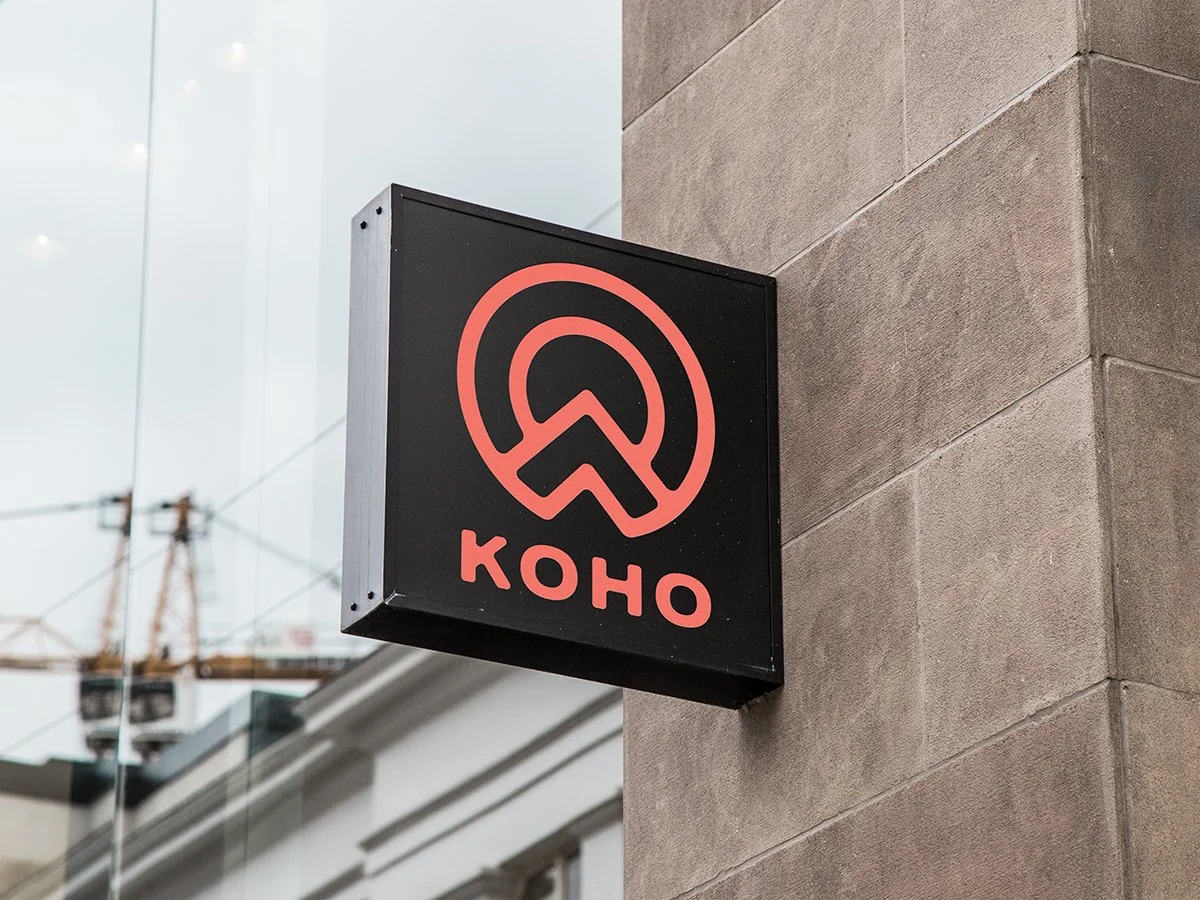
Drawing inspiration from the traditional Japanese “MON” or family crest, I designed a circular mark featuring the combination of a “SUN” & “MOUNTAIN” peak. This symbology referred to the journey of the Japanese-American community towards peak greatness. Wanting to appear more modern and non traditional, the pop colors are inspired by the vibrant colors of anime.