
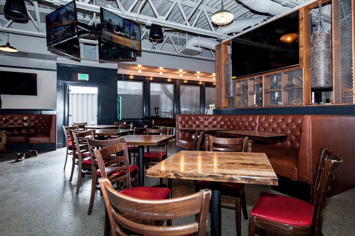
ART DIRECTION | IDENTITY DESIGN
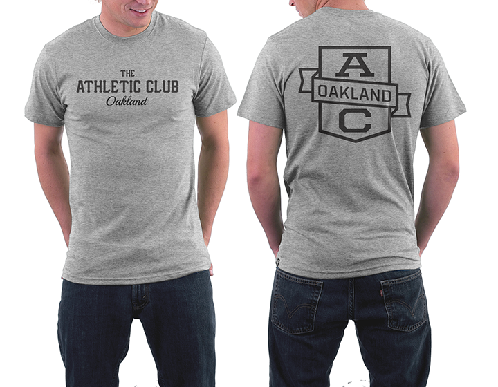
Working with PLINTH AGENCY, I worked on the brand refresh for The Athletic Club. Their first location in San Francisco was wildly successful for casual sports fans and die-hards alike. Their brand was rooted in the nostalgia for sports, but remained agnostic in terms of promoting specific teams, even from the Bay Area. The textures of rich leather, vintage hardwood accents, and locker room-esque metal grating give the brand its signature style. The actual branding was very minimal, so the challenge was to extend that vibe further into a menu, signage, and other environmental graphics for their new location in Oakland.

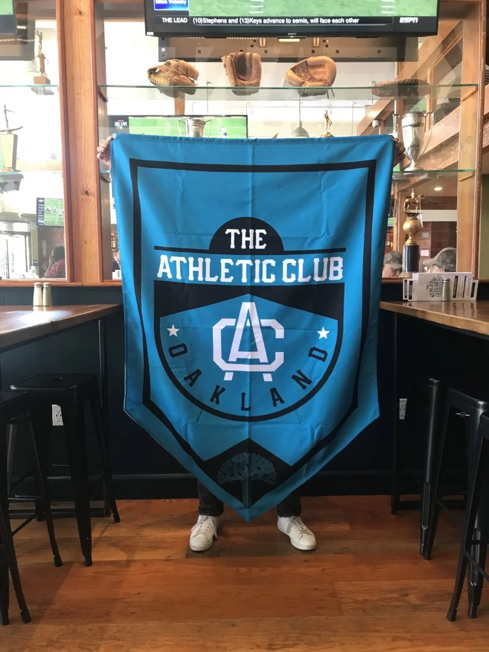
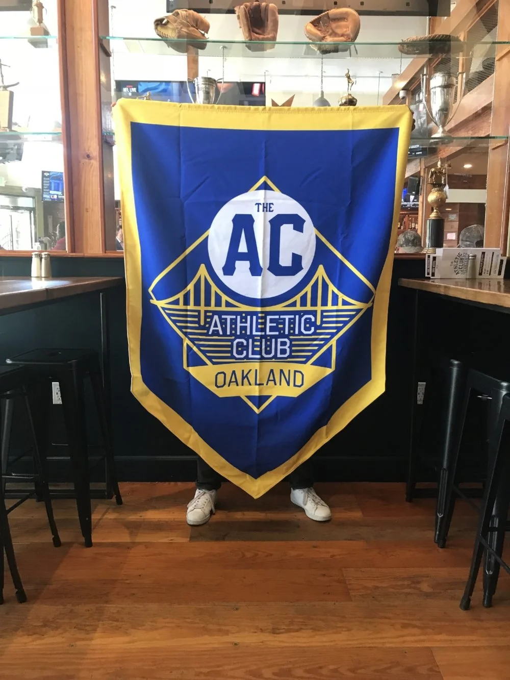
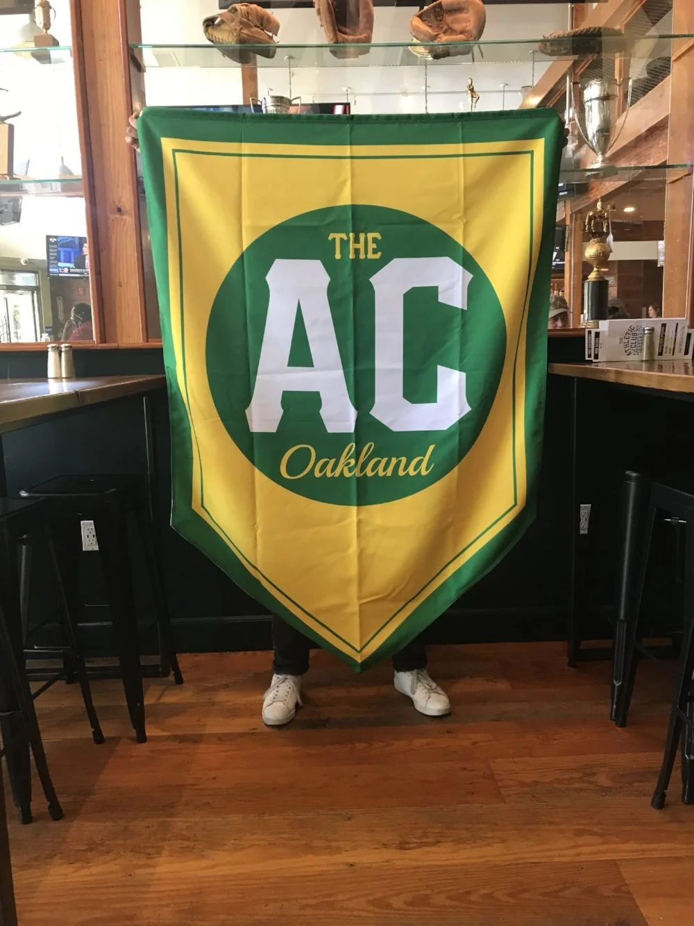
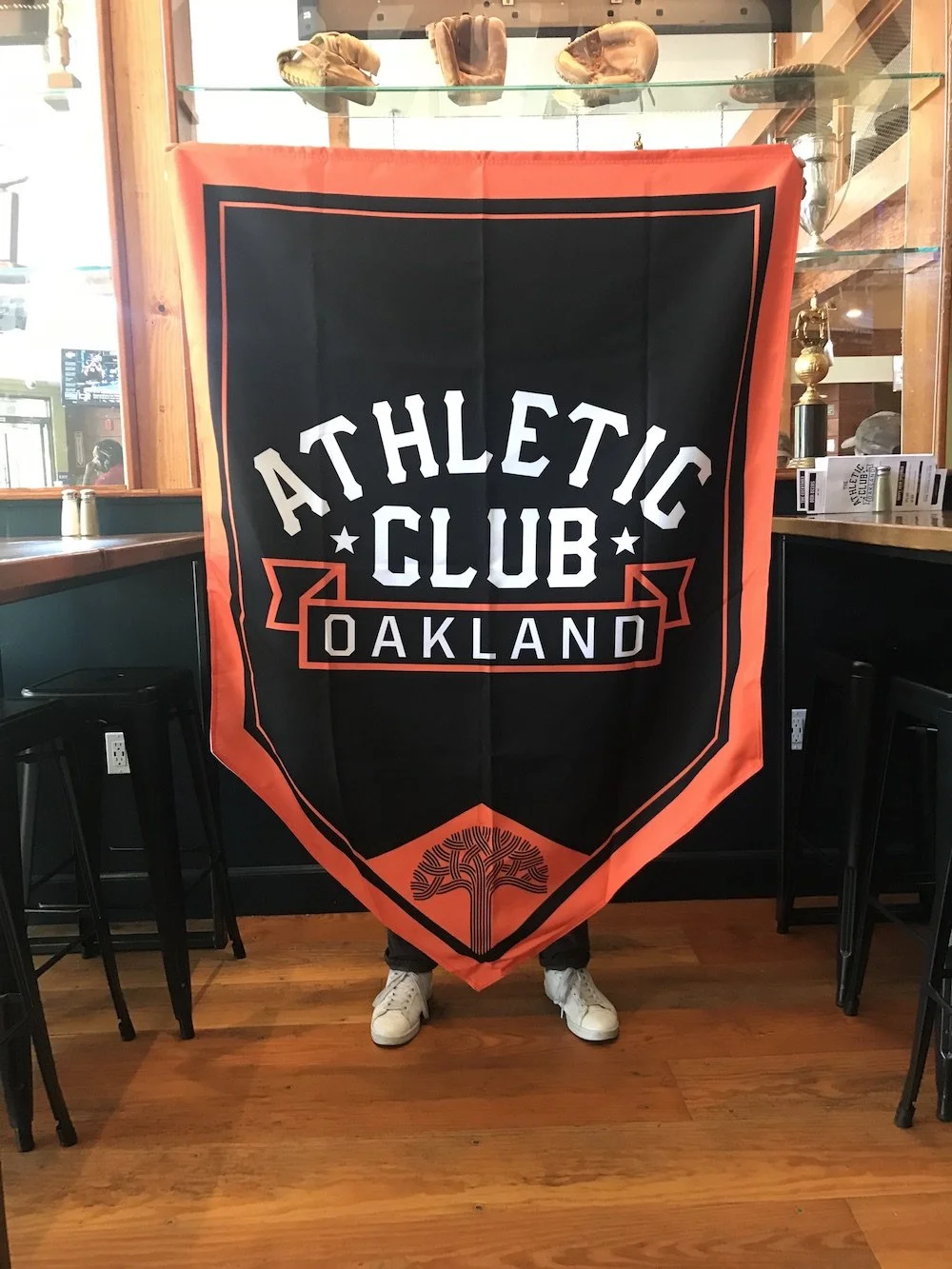
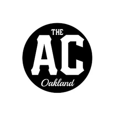
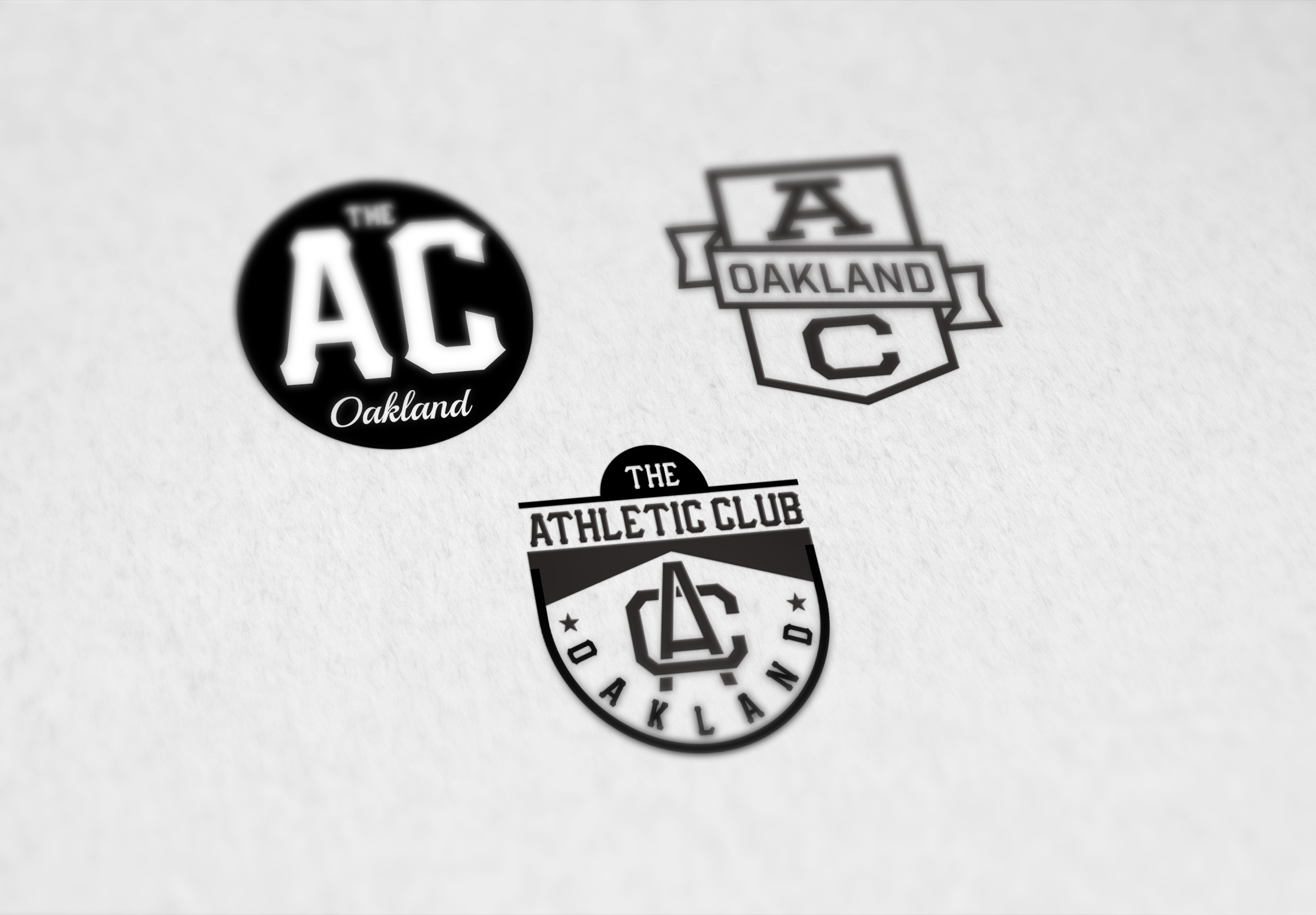
This project was more about extending the brand than reinventing it. I created a family of logos and marks that felt related to their main brand but still felt appropriate for their sports-themed bar.

I created flags that nodded to Bay Area sports teams without being too specific. I leaned into the iconic colors of Bay Area sports, but added the Athletic Club spin on it. These flags were hung from the ceiling to make use of the larger space and give visual interest outside of the plethora of screens lining the bar.